Iconography
Guidelines for product
WORD icons are simple and informative. Each icon builds on the visual language of the design system.
Detailed icons increase cognitive load. Focus on simplicity to help users:
- understand the concept the icon represents
- recognize the icon on smaller screens

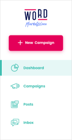
Fully customisable dashboard

Fully customisable dashboard
Literal symbols are easier to understand than abstract symbols. Whenever possible, use symbols that represent the most basic idea or concept instead of a metaphorical one.


Icons that have been used for a long time worldwide have a higher chance of being recognized and understood quickly. Don’t reinvent an icon that’s already been accepted as the convention.
For example, there are global, established conventions for concepts like “delete”, “settings”, and “search”. These symbols are effective, and don’t need to be redefined.


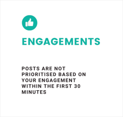
The purpose on an icon is to clarify the content by providing a visual cue and improve legibility and scannability of the user interface. In general, icons should be placed near a label or title. Never use an icon to replace a name of a product or feature.
There are rare exceptions where icons are universally understood actions, like with the trash can icon that represents deletions, and pin icons for pinning items like products. Whenever using an icon to represent an action, make sure to check that it’s commonly understood in other countries.


Guidelines for Website & Marketing
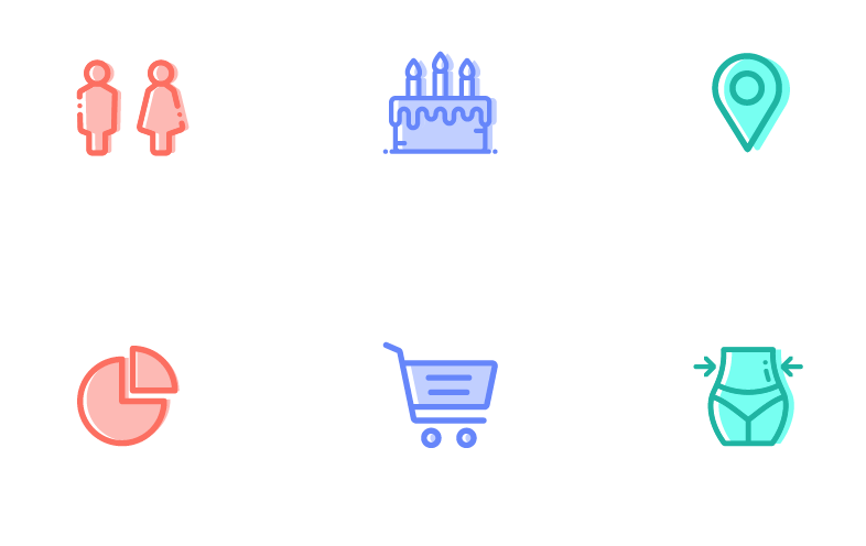
The iconography style used for the WORD brand is line icons. These have a border width
of 2px and play well with the pattern and logo
style
Use 40% opacity of the original color for the inner color.
Use this drop shadow style only on white background
When to use Icons
Icons are powerful visual helpers and should be used with care. Overuse quickly results in user interfaces that are visually overwhelming or distracting.
COMMON PLACES TO USE AN ICON
- in primary navigation
- inline with text to add clarity
- to direct a user’s attention to something they can take action on, or which results in an action
Iconography Applications
Icons in Social Media

Icons in product

Icons in website